Stick to Single-Column
- Jesilyn Barnes (Deactivated)
- Anonymous
Owned by Jesilyn Barnes (Deactivated)
Last updated: Jun 02, 2019
Forms should never consist of more than one column. One of the problems with form fields in multiple columns is that your users are likely to interpret the fields inconsistently. If a form has horizontally adjacent fields, the user must scan in Z patterns, slowing the speed of comprehension and muddying the clear path to completion. But if a form is in a single column, the path to completion is a straight line down the page.

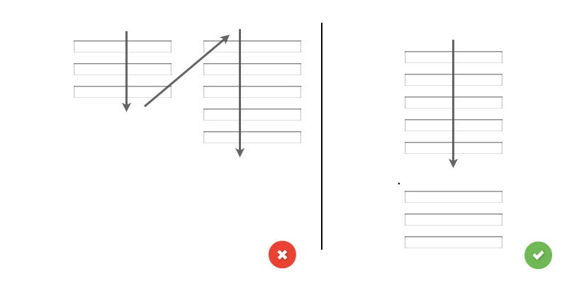
Issues w/ Multi-column
- Users omit fields
Because they do not notice them or because they misinterpret the meaning of the multiple columns, or - Fill out unrelated or incorrect fields
Because they misinterpret them to be part of the needed input.
Exceptions
One exception is for information users expect to see in a single line like:
- Our first, middle, last name: Sebasteean van Derlot
- Date and time: 16:30, 21 Feb, 2017
- City and state: San-Francisco, CA
, multiple selections available, Use left or right arrow keys to navigate selected items