Buttons (Guidelines)
- Jesilyn Barnes (Deactivated)
- Anonymous
Types of buttons:
- Normal buttons (Google calls them Contained buttons)
- Text buttons (R)
- Icon buttons (a button with just an icon)
- Toggle buttons (R)
- Outline button?
Components of a button:
- Label
- Icon
- Container
Google Material Stuff
- If a text label is not used, an icon should be present to signify what the button does.
- For maximum legibility, a text label should remain on a single line. (eh..)
- A layout should contain a single prominent button that makes it clear that other buttons have less importance in the hierarchy. This high-emphasis button commands the most attention.
Other buttons
An app can show more than one button in a layout at a time, so a high-emphasis button can be accompanied by medium- and low-emphasis buttons that perform less important actions. When using multiple buttons, ensure the available state of one button doesn’t look like the disabled state of another.
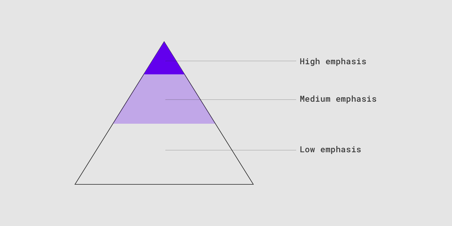
A button’s level of emphasis helps determine its appearance, typography, and placement.


Don’t.
Don’t place a button below another button if there is space to place them side by side.
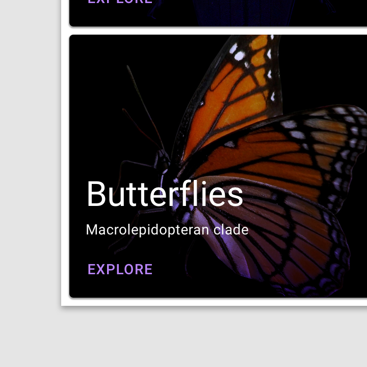
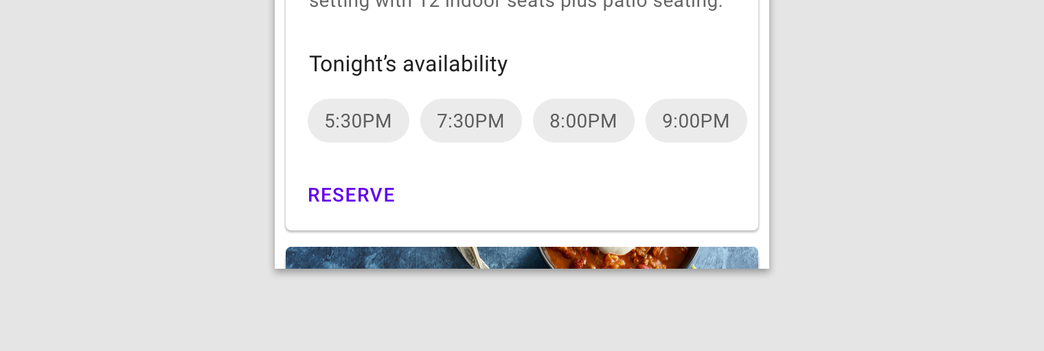
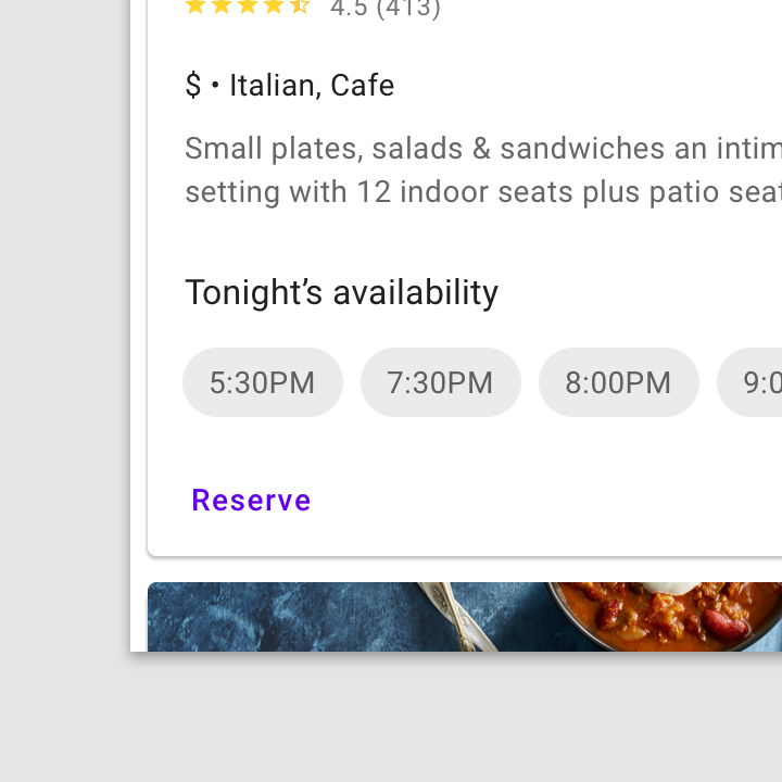
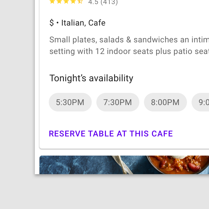
Text buttons are typically used for less-pronounced actions, including those located:
- In dialogs
- In cards
In cards, text buttons help maintain an emphasis on card content.
Text button

Use a text button in snackbars.
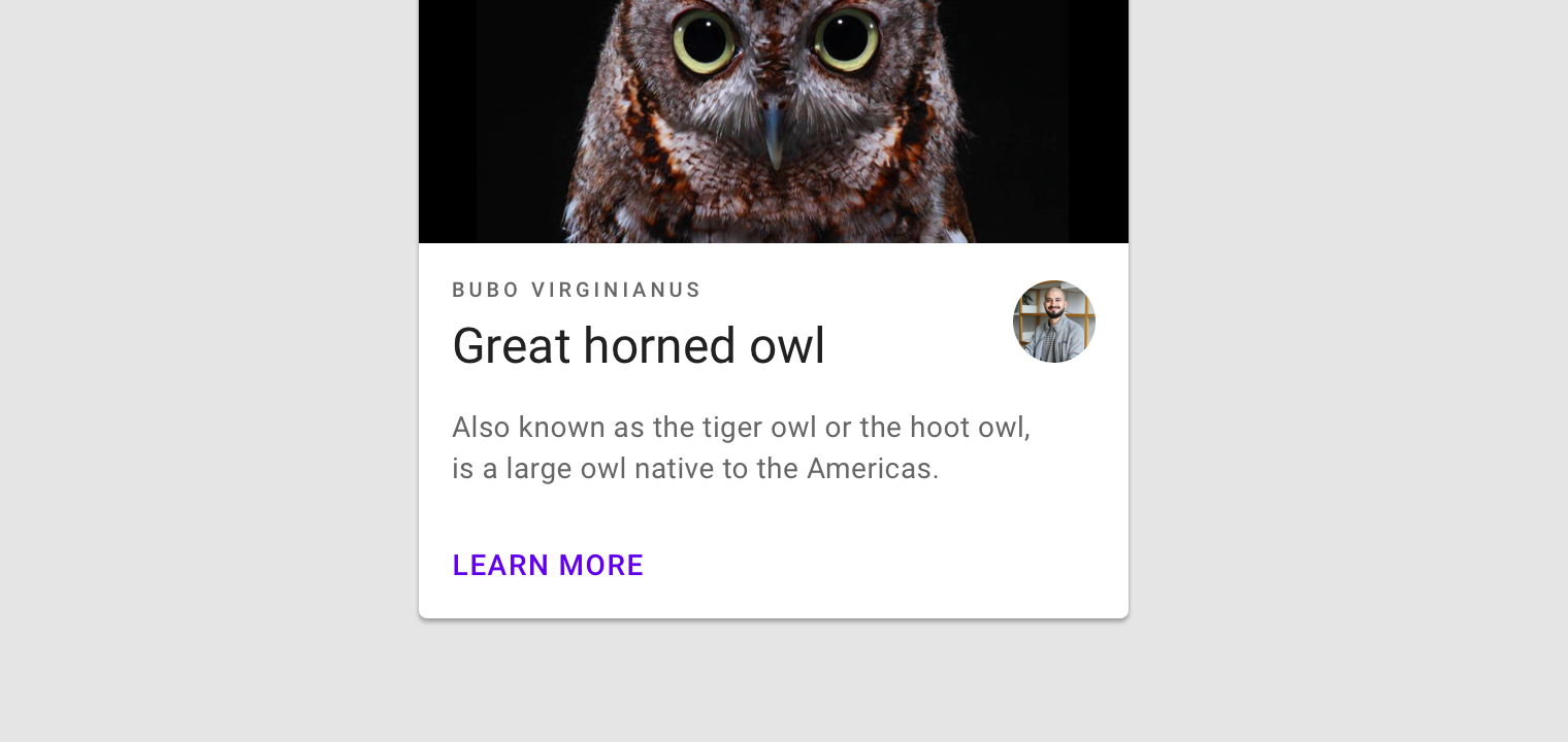
A text button against an image background
Text label
A button’s text label is the most important element on a button, as it communicates the action that will be performed when the user touches it.
Text label using a distinct action
Caution.
Text labels need to be distinct from other elements. If the text label isn’t capitalized, it should use a different color, style, or layout from other text.
Don’t.
Avoid text labels that are too long. They should be concise.
Placement
Text buttons are often embedded in contained components like cards and dialogs, in order to relate themselves to the component in which they appear. Because...
Text buttons are often embedded in contained components like cards and dialogs, in order to relate themselves to the component in which they appear. Because text buttons don’t have a container, they don’t distract from nearby content.
Dialogs use text buttons because the absence of a container helps unify the action with the dialog text. Align text buttons to the right edge for left-to-right scripts.
Text buttons minimize distraction from card content.
Text button states
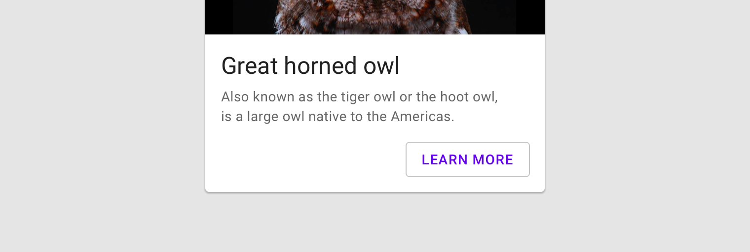
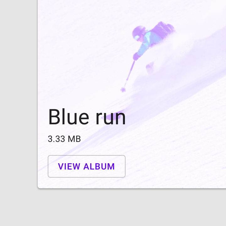
Outlined button
Usage
Outlined buttons are medium-emphasis buttons. They contain actions that are important, but aren’t the primary action in an app. Outlined buttons are also a lower...
Outlined buttons are medium-emphasis buttons. They contain actions that are important, but aren’t the primary action in an app.
Alternatives
Outlined buttons are also a lower emphasis alternative to contained buttons, or a higher emphasis alternative to text buttons.
Caution.
Protect text when using Outlined buttons in front of images. This image uses a light purple scrim to provide text protection for this outlined button.
Button container width can be set according to the responsive layout grid.
Contained button in a responsive layout grid
Icon
Contained buttons can place icons next to text labels to both clarify an action and call attention to a button.
Contained buttons can place icons next to text labels to both clarify an action and call attention to a button.
Do.
Use icons that clearly communicate their meaning.
Don’t.
Don’t vertically align an icon and text in the center of a contained button.
Don’t.
Don’t use two icons in the same button.
Toggle button
Usage
Toggle buttons can be used to group related options. To emphasize groups of related toggle buttons, a group should share a common container. Only one...
Toggle buttons can be used to group related options. To emphasize groups of related toggle buttons, a group should share a common container.
Selected action
Only one option in a group of toggle buttons can be selected and active at a time. Selecting one option deselects any other.
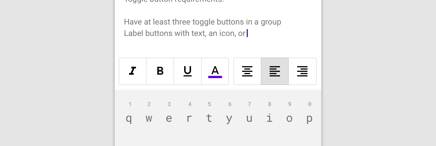
These toggle buttons present options for aligning text to the left, right, and center.
States
A toggle button’s state makes it clear which button is active. Hover and focus states express the available selection options for buttons in a toggle...
Active and available toggle buttons
A toggle button’s state makes it clear which button is active. Hover and focus states express the available selection options for buttons in a toggle group.
Disabled toggle buttons
Toggle buttons that cannot be selected can either be given a disabled state, or be hidden.
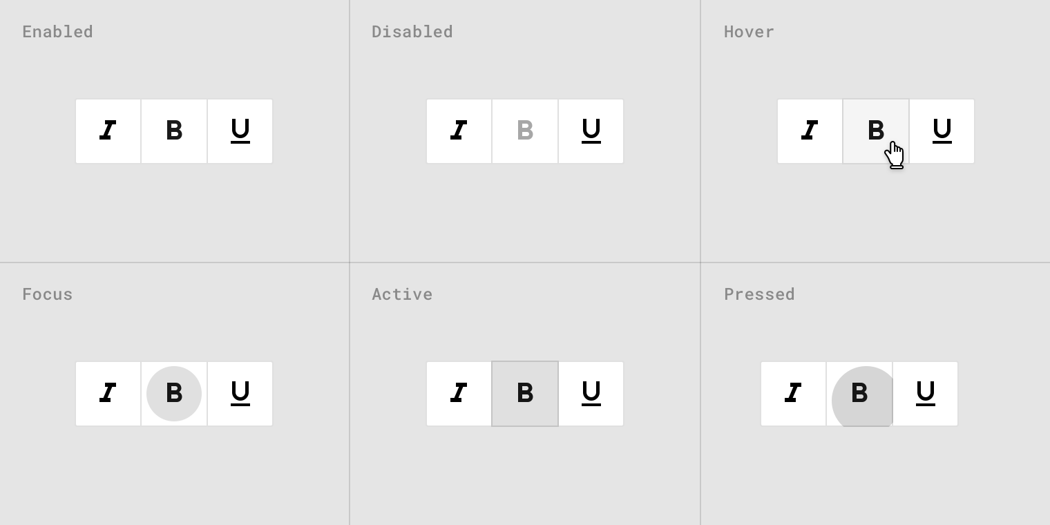
Toggle button states
Apple Stuff
Use verbs in titles. An action-specific title shows that a button is interactive and says what happens when you tap it.
Use title-case for titles. Capitalize every word except articles, coordinating conjunctions, and prepositions of four or fewer letters.
Keep titles short. Overly long text can crowd your interface and may get truncated on smaller screens.
Consider adding a border or a background only when necessary. By default, a system button has no border or background. In some content areas, however, a border or background is necessary to denote interactivity. In the Phone app, bordered number keys reinforce the traditional model of making a call, and the background of the Call button provides an eye-catching target that’s easy to hit.
Detail Disclosure Buttons/Info button
A Detail Disclosure button opens a view—typically, a modal view—containing additional information or functionality related to a specific item onscreen. Although you can use them in any type of view, Detail Disclosure buttons are commonly used in tables to access information about specific rows.

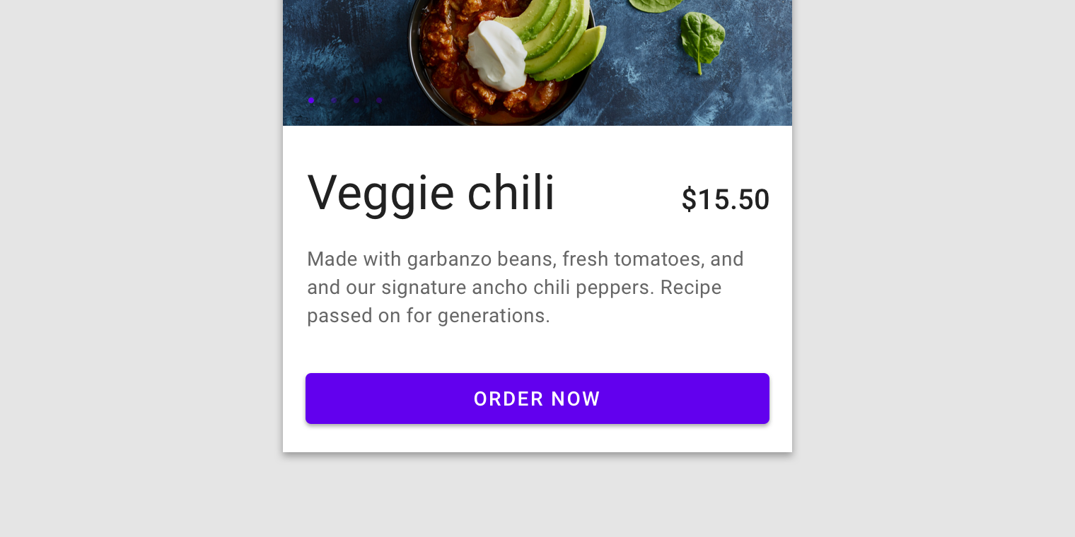
- Call to action buttons can serve a variety of functions. After all, “call to action” is really a bit vague. All it means is that it’s main purpose is to get a visitor to your site to do something.
- You want your call to action buttons to stand out from the surrounding content and really command attention from your site visitors. To that end, you need to make use of negative space around those buttons. Incorporate blank space between your content and your call to action button.
- Your call to action buttons should ideally be the largest buttons on a given page
- Use contrasting colors to make smaller buttons stand out more
- Use less distinct colors to make oversized buttons fit in better
- You call to action buttons need to command attention without overwhelming your design
- The exact wording you choose to use on your call to action buttons can have a huge effect on conversion. Compare “Buy Now” with “Add to Cart“. One is much more urgent than the other one.
- The language you use on your call to action buttons should be as straight-forward and simple as possible. You want visitors to know with just a glance exactly what they’ll get when the click on a button. If they question it, that means they’ve paused, which can lead to lower conversion rates.
- Use simple, direct language
- Use a large, bold font on the button for the main text
- Make sure the language clearly calls for a specific action
Provide Extra Information
Where appropriate, use your call to action buttons to give visitors extra information about what they’re going to get if they click on the button. This is most commonly seen with trial buttons or download buttons. Common examples of extra information include the length of time a free trial will last or the size of a file download. Version information is also commonly seen.

- Only include extra information when it adds to the user experience
- Extra information is only appropriate on some types of call to action buttons, most notably download or trial buttons
- Make sure the main call to action is still the most prominent text on your button
- Make sure the icons you use help clarify your button’s meaning, rather than confuse it
- Easily-recognized icons can immediately indicate meaning to your visitors
- Don’t be afraid to use less-commonly used icons, as long as their meaning is still clear
https://medium.com/eightshapes-llc/buttons-in-design-systems-eac3acf7e23
I can do things with buttons. Take a next step. Make a commitment. Get things done. With buttons, interaction springs to life.
That’s why Buttons are arguably a design system’s most important component. Devilishly simple, they offer a simple label in a defined region I can press. As such, buttons are where you apply a design language’s base attributes in ways that’ll ripple throughout more complex component later.
#1. Set a System’s Stylistic Tone
A button is the purest atomic expression of a system’s visual style. It combines the “big three” attributes— color,typography, andiconography — into a non-splittable atomic part.
Buttons also provoke discussion of space: padding inside (particularly, to a label’s left and right) and margin outside (adjacent to other elements). Ultimately, button can even surface more esoteric attributes like roundedness (via border-radius) and lift (via box-shadow).
Embrace the button as a leading representation of a system’s style. Bonus points if you align a button’s definition with a burgeoning set of token variables for color, size, space, and other fine details.Buttons pack in a wide range of attributes for such a simple element.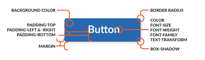
#2. Set a Verbal Tone, Too
Fortunately, “Click Here” is in our past. But we still need answers: How long can button labels be? Are labels written in the imperative (such as “Save” or “Close”)? Should I pair a verb (“Save”) with an object type (“Document”)? Are there preferred labels for common actions? Do we inject a brand voice…or not?
Takeaway: Jumpstart a consistent voice by including label guidance where I find button assets. Sure, a word lists and deep editorial standards can be found in documentation like a Voice and Tone guide. However, buttons are a great place to start bridging guidance together.

#3. Invert Buttons When Backgrounds Get Complicated
Most buttons work just fine on a white background. But what happens when you place it on a photograph? Or a different, darker background color? Heck, are you even allowed to put it on a light neutral color? Can you use a button anywhere? Can you change the color of a primary button?
Takeaway: Demonstrate viable backgrounds for your primary button, and codify an inverted alternative — white? a different color? semitransparent? — to apply when backgrounds darken. When documenting, show light and dark alternatives on a range of common backgrounds to drive the point home.
Show buttons a on variety of backgrounds, good and bad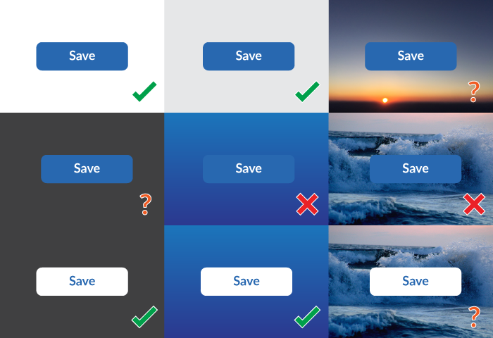
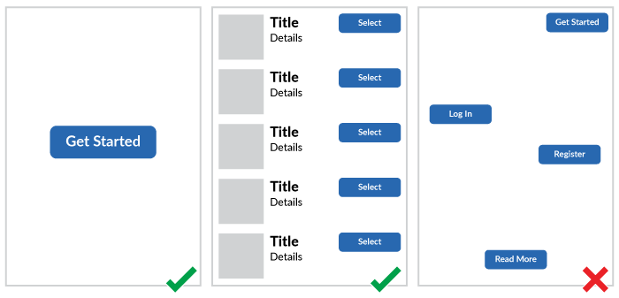
#4. Limit One Per Page, Unless Repeating a Primary Action
Buttons call for action. We often use a primary button to draw attention to a page’s highest priority action. Until, we can’t prioritize and there’s a bunch of primary buttons littered throughout a page (hopefully they’re consistent, right?).
In some cases, using a primary button is appropriate when you must choose from a parallel set of objects (like a stack of media objects in search results) or a settings page layout presents categories of options in equivalent modular regions.
Takeaway: Define when to use — and when to avoid — more than one primary button on a page.
#5. Design and Build a Button’s Arc of Interaction
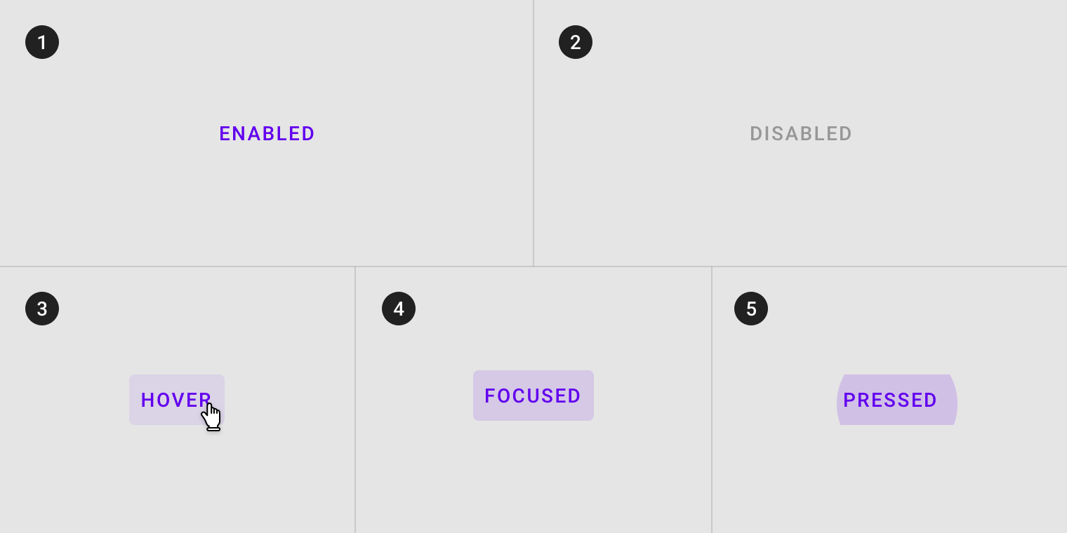
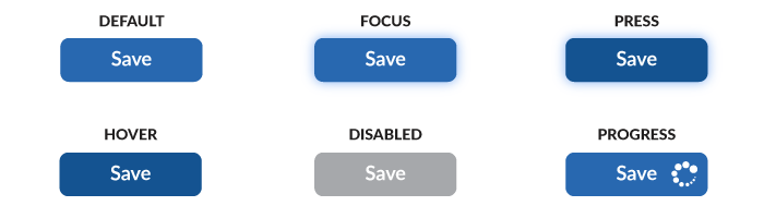
Buttons aretheprimitive interaction, and with interaction comes change. It’s not good enough to present a developer “Here’s the button design!” by just showing how it looks when a page loads. Instead, it’s up to the designer to show how a button appears across many states: default, hover, focused (“haloed”), pressed / active, and even a spinning waiting or animated progression.
Takeaway: Pair a live demo (just embed the button on the page!) with a gallery that shows the states without requiring readers to interact. Documentation isn’t a treasure hunt. Bonus points for including a video demo like Material Design does.
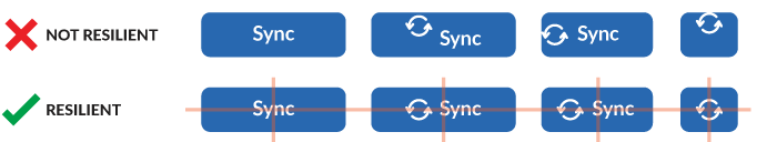
#6. Be Resilient to Mixed Elements
Pairing a button label with an icon reinforces meaning and quickens recognition.
Hold on! I thought buttons were a label in predictably clickable region. When you add an element, even a simple icon, a button layout shouldn’t break down. Coping with less predictable elements reveals pesky issues of spacing and alignment inside. You’ll wanna smooth these out, particularly if buttons can contain labels, icons,andother stuff.
Takeaway: Craft buttons to be resilient to including additional elements, whether in code or design tools. Users will want to add things — icons, labels, whatevers — and not worry about consequences of space and alignment. Set them up for success by doing that work for them.
The Secondary Buttons
#7. Ensure Secondary ≠ Disabled
No one yearns for gray buttons.
But you may find yourself needing to pair a secondary option with that inviting, saturated primary. You avoid a second saturated color, because that results in two saturated buttons next to one another, like green for Save and blue for Submit. Not even you, let alone your users, know which is more important.
So, you opt for a neutral. And the neutral is nearly or completed gray. And it looks disabled. Worse, when the primary is disabled, it’s now also gray. Next to your gray secondary. Sigh.
Takeaway: Solve for the secondary button colors and disabled states in concert. Make sure all your options work well together and none are inaccessible.
Which one is disabled?
#8. Beware of Ghosts in the Machine
Ghost buttons rely on only a border and label of the same color while lacking a background fill. Behind that label rests an uncertain future. Sometimes the label is on white (yes, that’s easy!). However, other times a flat color or visually rich photo make the label difficult to read.
Ghosts allure designers coveting a sophistication absent from chunky, higher contrast primary button. Yet, these are called Ghosts for a reason. They disappear. I’ve observed ghost buttons donning a cloak of invisibility in usability test after usability test. Participants don’t see them or can’t read them. This weakens or destroys a button’s value in affording action we intend.
Takeaway: Inject Ghost buttons into a system at your own peril. Studies I’ve observed suggest that ghosts perform poorer than filled counterparts. Plus, you might just avoid hours spent listening to polarizing designer debates on the subject.
Ghost buttons — even in simple situations — perform questionably. In unpredictable backgrounds? Forget about it.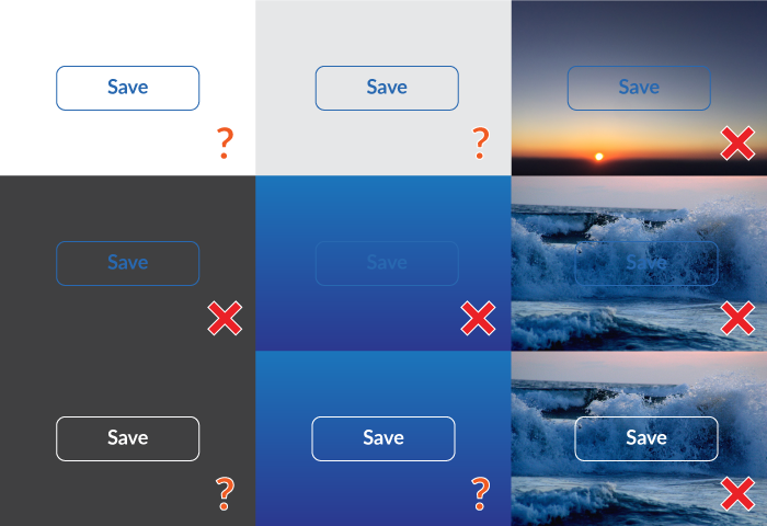
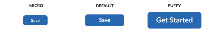
#9. Vary Size, Both Large (or Mega/Huge/Puffy) & Small (or Micro/Tiny)
Interactions can be found in tight spots like aCardobject or sidebar module. Other times, you need a massive button to sit on a full-bleed photo dominating the viewport.
Takeaway: Provide tooling to tune button size down and up as needed, as simple as another CSS class or design software style. Also, consider more memorable names — like “Puffy” or “Micro” — rather than a bland “Large” or “Small.”
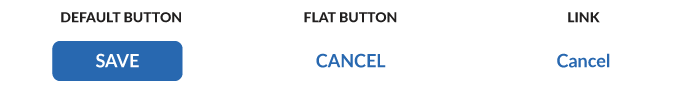
#10. Distinguish Buttons from Links
In the era of flat designs, systems like Material Design use a “Flat” buttonvariant for use as in toolbars, dialog action groups, and inline near text. In a default state, there’s little to no visual difference from a link. However, a button’s states and behaviors bring a whole host of distinct considerations from your simple anchor tag.
Takeaway: If your system offers a flat variant, be sure it’s conventional use — in both design and code — is distinguished from links. Additionally, cover all the interactive complexity such as focus & press states, spacing, and alignment.
Adobe Blog
https://theblog.adobe.com/the-evolution-of-buttons-in-ux-design/
1. Make it look like a button

Think about how the design communicates affordance. How do users understand the element as a button? Size, shape and placement all come into play here. Classic button shapes include the rounded rectangle. Someresearch suggeststhat rounded corners enhance information processing and draw our eyes to the centre of element. As mentioned above, one current trend is to use oval buttons. If you choose to deviate from traditional button shapes, make sure you usability test your designs to ensure that people can easily identify the buttons.
2. Pay attention to sizing

The size of buttons also play a key role in helping users to identify these elements. With the rise of responsive web, thinking about how the button will resize and percentage widths of buttons has become more important. As web visits from mobile devices continues to rise, we need to ensure that the buttons we design are large enough for people to interact with. This means considering the size of button elements as well as the padding between clickable elements. Various platforms provide guidelines on minimum touch targets. Results of MIT Touch Lab study found that averages for finger pads are between 10-14mm and fingertips are 8-10mm. The best way to test out your design is to look at them at scale on devices, and get users to interact with them. There is also a great touch Target Template that can guide you.
3. Order of buttons

The order that buttons go in, especially if there are corresponding pairs (such as ‘previous’ and ‘next’) is important. A few rules of thumb can help here. Ensure the design puts emphasis on the primary or most important action. This should be the visually dominant button. This can be done using color or size. Be sure to follow platform conventions for modals, as users will be used to seeing a certain button order and placement. You can find these guidelines online for all of the major platforms.
https://uxplanet.org/button-ux-design-best-practices-types-and-states-647cf4ae0fc6
Button States
This point is not so much about how the initial button looks like for the user, but it’s about hovering a button and finding that nothing changes. User might gets confused: “Is it a button, or not. Now I have to click to find out if that thing that looks like a button is actually a button. Well...”
Button isn’t a one-state object. It’s multi-state. And providing a visual feedback to the users to indicate current button state should be a top priority task.
https://uxplanet.org/7-basic-rules-for-button-design-63dcdf5676b4
1. Make buttons look like buttons
When it comes to interacting with user interface, users need to know instantly what is ‘clickable’ and what’s not. Every item in a design requires effort by the user to decode. Generally, the more time needed for users to decode the UI the less usable it becomes for them.
But how do users understand whether a certain element is interactive or not? They use previous experience and visual signifiers to clarify the meaning of the UI object. That’s why it so important to use appropriate visual signifiers (such as size, shape, color, shadow, etc.) to make the element look like a button. Visual signifiers hold an essential information value — they help to create affordances in the interface.
2. Put buttons where users expect to find them
Buttons should be located in places where users can easily find them or expect to see. Don’t make users hunt for buttons. If users can’t find a button, they won’t know that it exists.
Use traditional layouts and standard UI patterns as much as possible
Conventional placement for buttons improves discoverability. With a standard layout, users will easily understand the purpose of each element — even it’s a button without strong signifiers. Combining a standard layout with clean visual design and ample whitespace makes the layout more understandable.
Don’t play hunt-the-button game with your users
Tip: Test your design on discoverability. When users first navigate to a page that contains some actions that you want them to take, it should be easy to spot an appropriate button for the user.
3. Label buttons with what they do
Buttons with generic or misleading labels can be a huge source of frustrations for your users. Write button labels that clearly explain what each button does. Ideally, the button’s label should clearly describe its action.
Users should clearly understand what happens when they click on a button. Let me give you a simple example. Imagine that you accidentally triggered a delete action and now you see the following error message.
The vague label ‘OK’ doesn’t say too much about the action button does.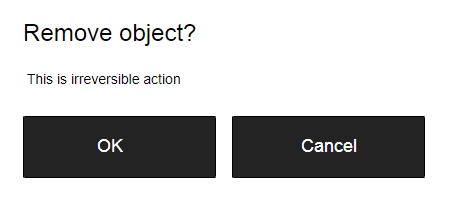
It’s not clear what does ‘OK’ and ‘Cancel’ represent in this dialog. Most users will ask themselves “What happens when I click on ‘Cancel’?”
Never designed a dialog box or form that consisted solely of the two buttons ‘OK’ and ‘Cancel’.
Instead of using ‘OK’ label it’s better to use ‘Remove.’ This will make it clear what this button does for the user. Also, if ‘Delete’ is a potentially dangerous operation, you can use red color to state this fact.
‘Remove’ makes it clear what button does for users.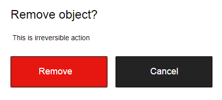 A potentially dangerous action ‘Disable card’ is colored in red in this interface. Image: Ramotion
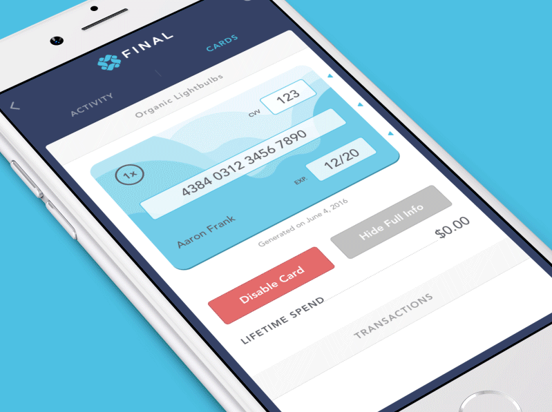
4. Properly size your buttons
Button size should reflect the priority of this element on the screen. Large button means more important action.
Prioritize buttons
Make the most important button look like it’s the most important one. Always try to make the primary action button more prominent. Increase its size (by making a button bigger you make it look more important for users) and use a contrasting color to capture user attention.
Dropbox uses size and color contrast to focus user attention on ‘Try Dropbox Business free’ CTA button.
. Mind the order
The order for buttons should reflect the nature of a conversation between the user and the system. Ask yourself, what order users expect to have on this screen and design accordingly.
User interface is a conversation with your users
For example, how to order ‘Previous/Next’ buttons in pagination? It’s logical that a button that moves you forward should be on the right, and a button which moves you backward should be on the left.
6. Avoid using too many buttons
This is a common problem for many apps and websites. When you provide too many options, your users end up doing nothing. When designing pages in your app or website, think about the most important actions you want your users to take.
Too many buttons.7. Provide visual or audio feedback on interaction
When users click or tap on the button, they expect that the user interface will respond with appropriate feedback. Based on the type of operation, this might be either visual or audio feedback. When users don’t have any feedback, they might consider that the system didn’t receive their command and will repeat the action. Such behavior often causes multiple unnecessary operations.
Why is this happening? As humans, we expect some feedback after we interact with an object. It might be visual, audio or tactile feedback — anything that acknowledges the fact that interaction was registered.
User interface provides visual feedback that a press has registered. Image: Vadim Gromov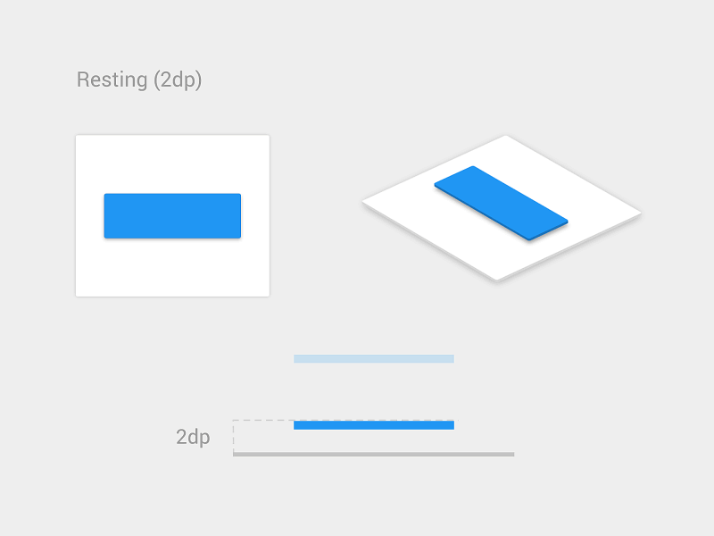
For some operations, such as downloading, it’s worth not only acknowledging user input but also show a current state of the process.
This button translates into the progress indicator to demonstrate the current state of the operation. Image: Colin Garven
https://www.invisionapp.com/inside-design/comprehensive-guide-designing-ux-buttons/
- In most cases, there are 5 main types of UX buttons: text, ghost, raised, toggle, and floating action buttons.
Text buttons
Text buttons are text labels that fall outside of a block of text. The text should describe the action that will occur if a user clicks or taps a button. Text buttons have a low level of emphasis and are typically used for less important actions. Because text buttons don’t have a container, they don’t distract from nearby content.
Ghost buttons
Outlined buttons (often called “ghost” buttons) are a step up in complexity and emphasis from a text button. They typically indicate actions that are important but not the primary action on a page. Outlined buttons should be exactly that: an outline with no fill surrounding text that indicates an action.
Raised buttons
Raised (or “contained”) buttons are typically rectangular buttons that “lift” from the surface of the screen via use of a drop shadow. The shadow helps indicate that it is possible to click or press the button. Raised buttons can add dimension to mostly flat layouts, and they highlight functionality on busy, wide, or otherwise congested spaces.
Toggle buttons
Toggle buttons are typically used for one of two reasons: to group related options or to showcase a selected action or setting. For the former, only one option in a group of toggle buttons can be selected and active at a time. Selecting one option deselects any other. For the latter, the toggle button indicates whether an option is active or inactive.

Floating action buttons
According to Google, “A floating action button (FAB) performs the primary, or most common, action on a screen. It appears in front of all screen content, typically as a circular shape with an icon in its center.” A FAB should perform a constructive action such as creating a new item or sharing the item on screen.

- The best way to indicate a button is to use visual cues. These indicators help people determine whether or not a button is clickable. It’s important to use proper visual signifiers on clickable elements to make them look and function like buttons.
Size
The first element to consider when designing a UX button is size. You should consider how large a button is in relation to the other elements on the page. At the same time, you need to make sure that the buttons you design are large enough for people to interact with.
A good rule of thumb comes to us from the MIT Touch Lab. Studies by the Touch Lab say that making your button a minimum of 10mm x 10mm is a great place to start. Keep in mind that with the rise of responsive web, thinking about how the button will resize and percentage widths of buttons has become more important.
Color
The primary action on a page needs to carry a stronger visual weight and have a distinct contrast from its surroundings. It should be the visually dominant button. For instance, adding one color to a grayscale UI draws the eye simply and effectively.
Secondary actions (like ‘Cancel’ or ‘Go Back’) should have the weakest visual attraction because reducing the visual prominence of secondary actions minimizes the risk for potential errors while further directing people toward a successful outcome.
Keep in mind that a button isn’t a one-state object. It’s multi-state. Make sure you consider the hover/tap states and active states of the button. Bear in mind that these states should provide enough contrast for people to clearly identify them as different from the default state.
Shape
As far as shape is concerned, a safe bet is to make buttons square or square with rounded corners, depending on the style of the site or app. Some research suggests that rounded corners enhance information processing and draw our eyes to the center of element.
One suggestion if you do choose to deviate from traditional button shapes is to make sure you conduct usability testing on your designs to ensure that people can easily identify the buttons.
Placement
Regarding UX button placement, try to use traditional layouts and standard UI patterns as much as possible because conventional placement for buttons improves discoverability. Using a standard layout will help users understand the purpose of each element — even if it’s a button without other strong visual signifiers. Combining a standard layout with clean visual design and ample whitespace makes the layout more understandable.
Microcopy
UX button microcopy is often a call-to-action that tells users what action they will complete if they click the button. Strong CTA microcopy has to catch users’ attention quickly and lead them right to the action.
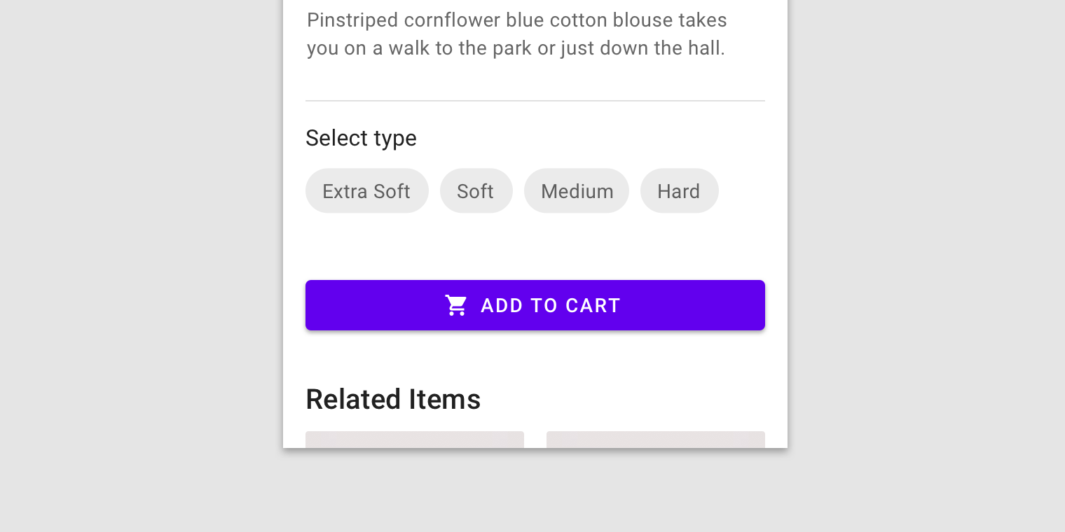
For a more effective call-to-action, keep the number of words at minimum. A few appropriately chosen words are much more effective than a long descriptive phrase. In addition, using action verbs and phrases like “Add to Cart” or “Submit” in CTA microcopy can help you give strong and direct instructions to your users on what to do next.


https://tubikstudio.com/ux-practices-8-solid-tips-on-cta-button-design/
What is CTA button?
A call-to-action (CTA) button is an interactive UI element both web and mobile. Its major aim is to induce people to take certain actions that present a conversion for a particular page or screen, for example, purchase, contact, subscribe etc.
- In our article Call for Attention. Powerful CTA Button Design, we described the vital aspects of an effective CTA button design which are size, color, shape, placement, and microcopy.
Tip 1. Make buttons look clickable
A prior task of any CTA is to make users click it, so their design should coincide with the objective. Using a product people don’t want to figure out which of the design elements are interactive. That’s why it’s important to ensure all the interactive elements appear clickable.
Tip 2. Choose the bigger size
Size is one of the most common tools helping to arrange UI components according to their importance. The bigger an element is, the more noticeable it becomes. Since CTAs’ prior goal is to draw users’ attention, designers usually try to make them stand out among the other buttons on the screen, especially via noticeable size.
Tip 3. Apply contrasting colors
Color choice depends on various aspects which make the process more complicated. Designers need to consider such factors as the basic color of the composition as well as potential preferences and psychological peculiarities of the target audience.
There is one condition which is vital to keep in mind while choosing colors for CTA: buttons and background colors should be contrasting enough so that CTAs would stand out from the other UI components. For example, if a designer uses the blue color palette for the layout, it would be a good idea to use red or yellow color for CTA buttons.
Tip 4. More imperative, fewer words
CTA microcopy is actually a call which tells users what action they will take if they click the button. The powerful CTA microcopy has to catch users’ attention quickly and lead them right to the action.
To make an effective call-to-action, you need to keep the number of words at minimum. A few appropriately chosen words work much faster than a long descriptive phrase. In addition, applying imperative case in CTA microcopy, you give strong and direct instructions of what users can do next.
References
- https://uxplanet.org/button-ux-design-best-practices-types-and-states-647cf4ae0fc6
- https://uxplanet.org/7-basic-rules-for-button-design-63dcdf5676b4
- https://www.invisionapp.com/inside-design/comprehensive-guide-designing-ux-buttons/
- https://material.io/design/components/buttons.html#
- https://tubikstudio.com/ux-practices-8-solid-tips-on-cta-button-design/
- https://designexcellent.com/best-practices-for-buttons-the-user-experience-of-colors/
- https://www.justinmind.com/blog/7-rules-for-mobile-ui-button-design/
- https://atlassian.design/server/components/buttons/
- https://www.smashingmagazine.com/2016/11/a-quick-guide-for-designing-better-buttons/
- https://www.nngroup.com/articles/back-to-top/
- https://developer.apple.com/design/human-interface-guidelines/ios/controls/buttons/
- https://www.hongkiat.com/blog/call-to-action-buttons-guidelines-best-practices-and-examples/
- https://medium.com/eightshapes-llc/buttons-in-design-systems-eac3acf7e23
- https://theblog.adobe.com/the-evolution-of-buttons-in-ux-design/