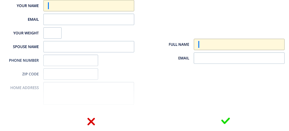
Keep the Form Short
- Jesilyn Barnes (Deactivated)
- Anonymous
Owned by Jesilyn Barnes (Deactivated)
Last updated: Jun 02, 2019
Only ask what's required. Minimize extraneous fields. Reduce the form to only the critical pieces of information.
“I have made this longer than usual because I have not had time to make it shorter.”
~ Blaise Pascal
Eliminating unnecessary fields requires more time, but the reduced user effort and increased completion rates make it worthwhile. Remove fields which collect information that can be (a) derived in some other way, (b) collected more conveniently at a later date, or (c) simply omitted.
Tips
- Before you even get into the details of your form, ask yourself: “Is this form really necessary?” If you hesitated while answering that, re-think the purpose of the form.
- Break it into chunks. Smart form features and designs can greatly minimize how intimidating the form appears to users.
- Always question stakeholders why and how the information you request from users is being used.
- Ask yourself if the question can be inferred, postponed, or completely excluded.
- Get the data from another source. Data entry is increasingly automated. For example, mobile and wearable devices collect large amounts of data without the user’s conscious awareness. Think of ways you can leverage social, conversational UI, SMS, email, voice, OCR, location, fingerprint, biometric, etc.
Benefits
- Boosted conversion rate
Every time you cut a field or question from a form, you increase its conversion rate — the business case for this guideline is that simple. - Reduced cognitive load
Users are often intimidated when seeing a long page filled with form fields and selections. During testing, many test subjects feel overwhelmed and intimidated when presented with 10-15 form fields or more within the same viewport.
, multiple selections available, Use left or right arrow keys to navigate selected items