Avoid Placeholders
- Jesilyn Barnes (Deactivated)
- Anonymous
Placeholder text works great for a simple username and password form. Placeholder text causes many usability problems and is best avoided.
Yes, they are very popular, and yes they do look nice. But once the user clicks on the text box, the label disappears and thus the user cannot double check that what he/she has written is indeed what was meant to be written. Another thing is that when users see something written inside a text box, they may assume that it has already been prefilled in and may hence ignore it.

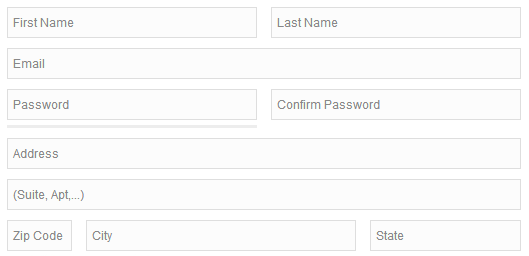
Even if the label is separate, adding a hint suggests, at a glance, that the field is filled out. NN Group eyetracking studies, as one example, have illustrated how empty fields draw more attention than those with text, and that users are more likely to skip fields with placeholders than those without. In other words, supposedly helpful hint text within a field does more harm than good, and is especially problematic for scanners.

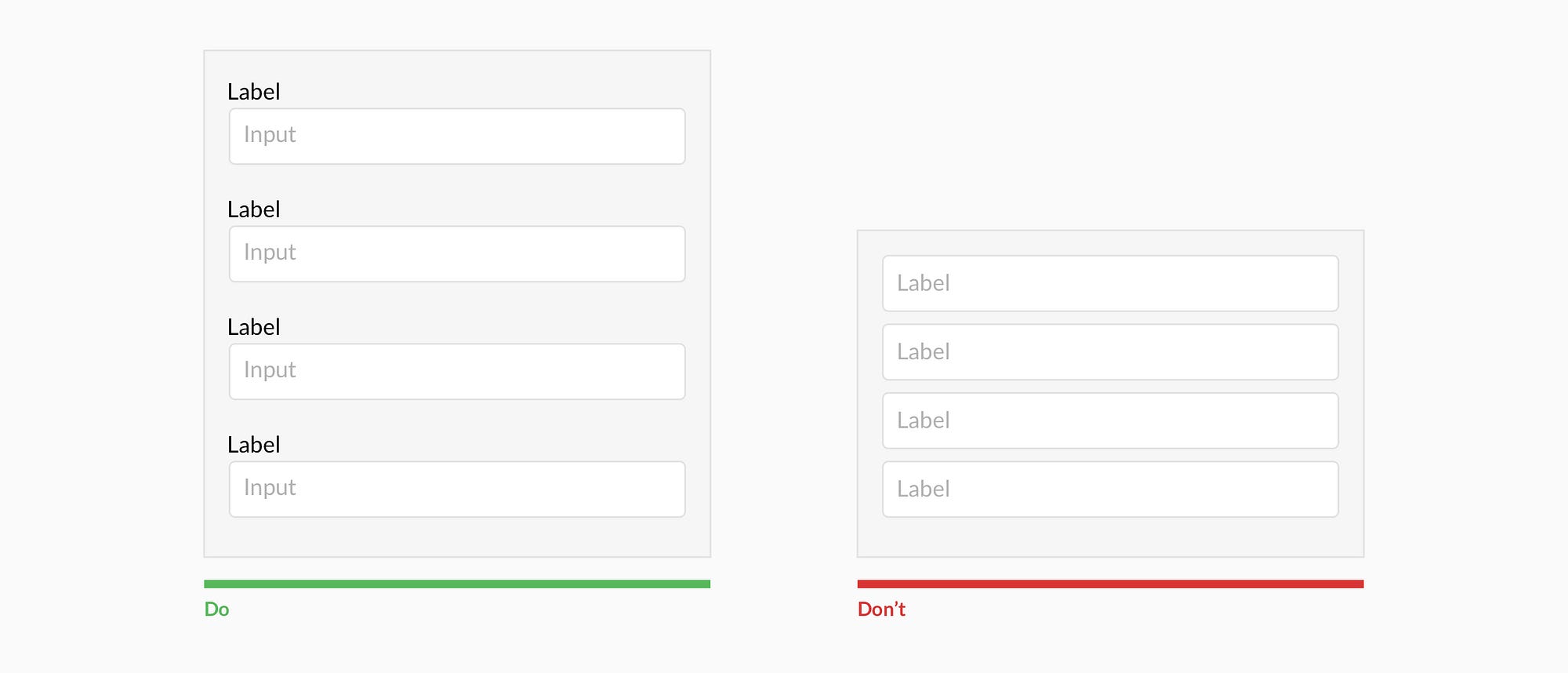
Good: an empty form field
