Align Labels Properly
- Jesilyn Barnes (Deactivated)
- Anonymous
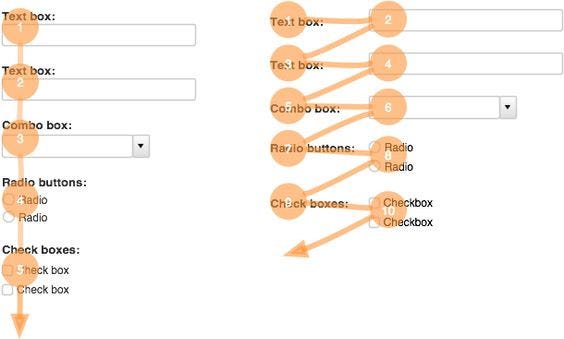
Forms are completed faster if the labels are on top of the fields. They are good if you want users to eye-scan the form as fast as possible. However, if you want your users to read carefully, put the labels to the left of the fields. This layout is read in a slower down and right (Z shape) motion.
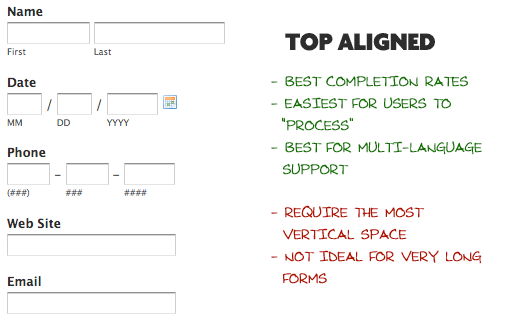
Top-aligned labels
The biggest advantage to top-aligned labels — they make it easier for different sized labels and localized versions to fit easier within the UI (this is especially good for mobile screens with a limited estate).
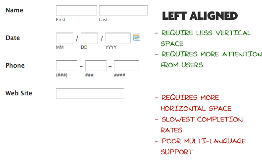
Left-aligned labels
The biggest disadvantage to left-aligned labels is the slowest completion times. This is likely because of the visual distance between the label and input field. The shorter the label, the further away it is from the input. But slow completion rates aren’t always a bad thing, especially if the form requires important data. If you are asking for things like Driver’s License or Social Security Number, you may implicitly want to slow users down a bit and make sure they enter things correctly.
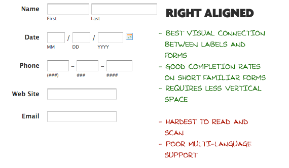
Right-aligned labels
The big advantage to right-aligned labels is the strong visual connection between label and input. Because items near each other appear related. This principle of placing related items closer to each other isn’t new; it’s actually theLaw of Proximity from Gestalt psychology. For shorter forms, right-aligned labels can have great completion times. Right-aligned labels disadvantage comes from comfortability. Such form will lack that hard left edge, which makes it less comfortable to look at and harder to read.