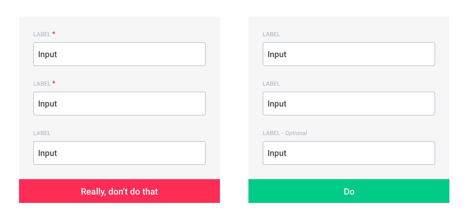
Avoid optional fields in forms unless absolutely necessary. But if you use them, clearly distinguish which input fields cannot be left blank by the user.
One Exception: Checkout
One area where you want to mark both Required AND Optional is in Checkout. Large-scale Cart & Checkout testing revealed that failing to explicitly mark both required and optional fields leads to unnecessary validation errors, user confusion over which fields they must complete, a slower checkout process, and even abandonments. The issues caused by failing to mark required and optional fields were first observed during Baymard's first rounds of checkout usability testing dating back to 2010. Since then this behavior has been reconfirmed during all subsequent checkout usability testing. See this article for more information.
