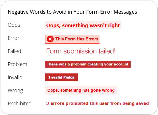
Create concise, directional, friendly copy for error messages. Avoid long summaries of errors at the top of your page. Instead, state there are errors on the page for the users to find by obvious signposting.
We should always try to reassure the user, not blame them for their mistakes. It is all too common that users blame themselves for problems. Compounding that further with aggressive and unhelpful language only pushes them off the site. Instead, if there are particular requirements for a field, always stipulate them clearly upfront and save everyone the hassle of reminding them through validation.
